Thursday, 31 May 2012

blog 5


The former Bank of New Zealand on Lampton quay was the first Bank of New Zealand. Built between 1899 and 1901 by architect Thomas Turnbull, the Bank building is Barque revival. It had a use of strong geometric shapes with the flued columns, arched windows and triangle cupolas but also lavish ornaments such as the lions and human heads imbedded in the walls, and organic flowing curves within the structure. It was said that there was meant to be more ornaments but the Government wouldn’t allow it, saying it was to lavish for a bank.
Before the bank was built John Plimmer owned a warehouse “Plimmer’s Ark”m the timber from this was recontracted into the bank and can still be seen today in the BNZ basement. The bank was used as the National Head Office and Wellington branch from 1901 through to 1984. Following this it moved to a new location. People had plans to pull it down to make way for the building boom of the 1960’s - 80’s, but for the next 20 years people fought to keep the bank building. In 1999 the bank was opened as a retail complex that has access to an underground mall and The Grand Arcade on Willis street. The Bank is now protected by the Heritage Order, meaning that the building will not be destroyed in the near future.

Kelly, M. (1961). Heritage trail. Old shoreline, Wellington city. Wellington City Council, Wellington, New Zealand

Cattell, J. (1986). Historic buildings of Wellington: a register of classified buildings. Government Printing Office Publishing, Wellington, N.Z.

Griffin, RH. (2001). Old BNZ Wellington : an architectural survey of the buildings used by the Bank of New Zealand on the Lambton Quay - Customhouse Quay - Hunter Street site. O'Griffy. Auckland, N.Z.


Wednesday, 30 May 2012

movie

I just found out the last film didn't upload properly so this should work

milk audio

For this advertisement, we wanted to expand upon the original poster we did for the first project. We further pursued the concept of ‘Milk Audio’ being a young company that supplies audio equipment for up and coming artists for both personal and commercial use. 
We had the idea of the milk carton being a hybrid of milk and a speaker and having it reach a tipping point when it can no longer contain the music inside it. We then have the milk, which is mixed with notes and musical lines, rush out of the carton and hit the right side of the screen. It then over flows and the wave of milk falls back onto itself, effectively white washing the screen before the company’s title and tag line are revealed when the milk drains down the screen. 
This is to showcase the feeling of being overcome by music, whilst using the companies affiliated colours and logos. We believe it will be popular with our predominately youth orientated demographic utilising synaesthesia, attractive colours and clean graphics to create a memorable advertisement for the company.
For this advertisement we used Flash to animate the clip and the graphics were created in Photoshop.


Thursday, 17 May 2012

3D printing precedents


I also looked at 3d printing examples to see what other people had made with the printer, get inspiration and see what my limitations were. 

precedents


http://society6.com/thepapercrane/Origami


http://society6.com/thepapercrane/Modular-Origami


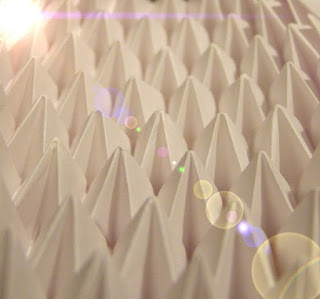
I liked the idea of paper, the way that it can be formed into different shapes and give a completely different effect, they how the geometric forms in models in the way paper can be foled, it gives crisp strong bends. i alos like the may that the using of cuttiing and then layering can create a very effective pattern if exacuted well.

Wednesday, 16 May 2012

precedents

I really like the use of objects making words i think this idea would help grasp the idea of industrial design with the use of construction. I could construct the words from the quote out of different materials.  
I like how they use different colours to create a moving image, how even though post it notes are simple the fact that they are brightly coloured helps to contrast them and give the flat image more depth.
I feel that this image focuses more on media design rater then industrial but still feel it is exacted well.
I like how 1000's of small candy was used to make this music video, how they can create moving images with M&M sized candy. but it has been exerted will to show movement.
I deiced I could use object to create words so i looked up what other people have used. I could ones made with large object (like making it out of people) and down to alphabet soup. also making the letters like blocks to make 'Imagine' and food like ' say' and 'cheese' or using pre made letters like the blocks and the soup. Industrial design uses different materials so these images help reflect the idea of industrial design.

I know this isn't a stop motion video but I like the fact that it uses object in a creative way to make the film interesting. I think this film shows aspects of industrial design in the way that they use construction and physics (with momentum, gravitation, force and velocity) to construct this structure. 

with the idea of the Ok Go video clip I thought I could construct a path of some sort to show movement within it, but it could be hard to execute. but would show the main aspects of industrial design.


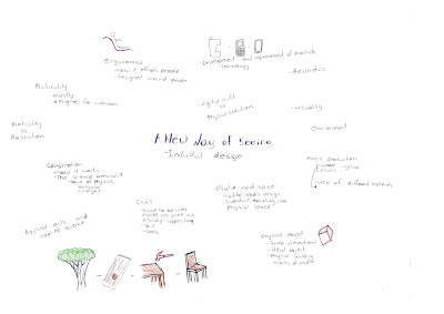
Industrial design brainstrom

group one

individual one

Sunday, 13 May 2012

photos of development

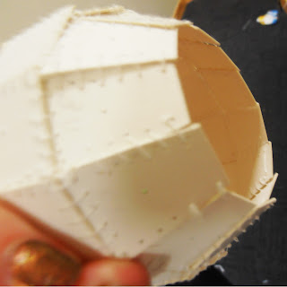
I stated off messing the ball into 6th to create my sketch model by taking the circumference and devising it into 12. 


I then used the measurement and drew on the sections  and then from that I worked out the sizes of the squares I wanted it to go 12 squares around. I cut them out and placed them on to see if they would fit.

I then started to sew them together.
I sewed three lines of card together 


I tried it off the ball and it kept it shape so I thought I could be a go sketch model that I could develop into the final model.
I decided to find way to find out how to join the two circles together 

 sewing the laser cutting together


Friday, 11 May 2012

Extraordinary strength.


"Could I put pieces in there that would hold their own in this extraordinary structure?"
                                                                                                                   -Dale Chihuly


I tried to find the right balance between the curves and straight lines in creating this model.  I looked into the work of Dale Chihuly an American Glass sculptor. In my research I came across two contrasting pieces of work one focusing more on the curves the other on the linear aspects; ‘Garnet Brown Persian’ is made with just one single sheet of glass this object represents fluidity with the use of soft forms and curving geometry. While the ‘Red Spears’ grasps the use of balance and strength, as each pillar is balanced against each other. Both made from glass but the two objects contrasts each other immensely in form and structure. One is strong and stagnate and works against it surroundings, while the other is soft and fluid and moves with the surroundings.
I tried to incorporate the main aspects of his work into my own with the use of soft curving lines and asymmetrical forms with the use of the vellum strips curving within itself all at different lengths to create the idea of fluid. Like the ‘Red Spears’ I tried to create a piece that was supported only by its self, this is shown with the use of string as tension is created as the vellum strips pull away from themselves, creating linear lines with in the curves. The use of thread helps to create soft movement within the pieces, as it is as delicate as the vellum so will move with the conditions placed on it. 

Garent Brown Persian-Dale Chihuly
red spears-Dale Chihuly


Chihuly, D. (2008). 365 days / Dale Chihuly. New York : Abrams