Showing posts with label hand in. Show all posts

Monday, 29 October 2012

Project 3 DSDN 112

PRECEDENTS


 I felt that I liked the idea of making a stop motion as I felt it would be an effective way to present my movie. I looked into stop motion videos on you tube and vimeo for ideas on how to make it and I really liked the the theme where they make stop motion out of paper, I felt that it would reflect my app well as my app is made out of text. i liked theres videos from vimeo;
http://vimeo.com/2295261,
http://vimeo.com/3715286,
http://vimeo.com/15263537,
http://vimeo.com/5020134,
http://vimeo.com/41519839
all of these videos use paper to create stop motion, some give the vintage feel which I like as if reflects my app, while others use different colours of paper to contrast the different imagery and to make it bold and stand out.

FIRST IDEA

My first Idea is to make a 3D world made out paper with words on it, such as magazine or news paper pages and have stop motion of a cut out of a person walking through it to reenact my app


 I made two of the walls to trial it but I felt to execute this well it would require a lot of time so i felt i should simplify my idea.

IDEA TWO

my second idea was to make people out of paper such as news paper or magazine paper as it would reflect my app. I felt that they would be easier to stop motion then making the 3d world in my first idea. I first made silhouettes of people but i felt if i made them they would take time as each movement i would have to cut out a new person.
so i tried to make a cut out of a person which moved so i made different parts that moved such as arms and legs and then put pins in them so they could move. after making one in white i felt i should make one that contrasted with it as i could use an off white background like my app and then the person wouldn't stand out. So I made one in red. I haven't figured out how I could incorporate them. 


i made a small stop motion to show how i could make them walk.

STORYBOARD

this is my story board i felt i would make it simple. in the movie i want ti to walk through what the app can do. with a person being lost and writing on the wall saying they are lost, I felt that she should write on the wall as I felt it reflected my app as it incorporated the idea of using words as a main idea. they would then place the phone on the ground and the app would fold out of the phone the would then play till the main screen then go back to them saying they cant find there friend then would show how they found how they are on campus and then from there would stop motion of them walking with the walls will have a overlay of text just like the app but putting in on the actual walls on kelburn. 

WALLS

in my movie i want there to be iteration with the user and the app such as opening the app and showing how they use it. but also have things that happen 'in the real world' to relate back to the app. the two ideas i have come up with is having the user wright on the walls saying that they are lost, so the audience knows that they are need something to help them direct them on where to go. 
Also in my app when it goes into 3D view it has the walls made up of text and this text tells them where to go and where they are located. I want to incorporate this idea into my app by having stop motion of the user walking though kelbun and have text overlaying the walls

I am a small stop motion to see how it looked, I found that this was very time consuming as on each frame i had to move the text and then line it up to where it was stilling in the previous frame. I also found that there was to much going on when I had them up and you lost focus on the person walking. 


FLASH

I had great trouble with Adobe flash this time around, It spent most of the time freezing or quitting which resulted in me spending hours trying to export the movie parts of my app in to quick time so i could try make my movie in iMovie which worked with less tantrums

ADD ON'S

I added a new part to my film that I didn't put in my story board. I felt that i should explain to the user what each main button did so I had the sham hands used in my app to point on each option and tell the user and audience what each button did.


MUSIC

I spent ages trying to find the best sound to fit my film, I wanted a tune that was happy and quirky as i felt it would give a positive spin on the film. I decided on a tune that i found on http://freemusicarchive.org a song by Oskar Schuster called Sneeuwland

MY FILM

My film is found on my Vimeo Account https://vimeo.com/52429863

Thursday, 4 October 2012

5 imagers


these are 5 screen shots of my app, I felt that these five all showed completely different aspects of my app, such as both the 3D and 2D paths and also some of the menus and showing how some of them are selected like circling or drawing a line through it. 

In the 3D viewing it is meant to say Cotton on the lift doors not corron.

about app


Campus Compass is designed for Victoria University students easily and effectively finds their way around Kelburn Campus.  It is to be used to find places such as, tutorials, lectures, dining facilities, tutors, toilets, departments, offices, and friends. To create this I wanted to go for the simple unique, old fashioned look and handmade style.  One of my precedents was the marauders map, reflecting how the walls are made out of words; I think this would be helpful to the student using this application, as it would have the names of the buildings they were in on the walls, along with the rooms that you were passing. I used this style twice in my work, firstly in the 2D viewing, where the map constructed with names of each building creating themselves, along with words that relate to Victoria University such as, Kelburn Campus, Victoria University and Wellington. The second time this style was used was in the 3D viewing which also used words that related to the location and Victoria University, but it was also telling the Student where to go, such as ‘turn right’ or ‘go to second floor’. I felt that using an arrow to show the way was not reflective to my old style and instead deciding that the idea of using hands to put them in the correct direction would be more fitting.   The fingers on the hand would even motion the walking movement, while also would push buttons and point with the index finger. The path that I decided to use in my Application was to find a friend; with this you could find a list of your contacts that also have the app. When clicking on their profile, the screen would tell you if they are on campus, Blue Square indicating that they are available on site and a red square showing that they are not on University grounds.   When clicking on the selected square it will show on the 2D map were they are in relation to yourself, and will then walk the path from you to them.  After this, it will transfer to the 3D viewing which will show the user how to get to their location at a reflective speed to their walking pace, with the fingers indicating how to get there.  When you selected friend is in sight a blue dot will appear, flashing on your screen to show that you have reached your destination. 

Thursday, 20 September 2012

App viewing

this is a few of my screens i want to use for my app, I am still trying out fonts, colours and sizes. 

Sunday, 19 August 2012

photos


write up


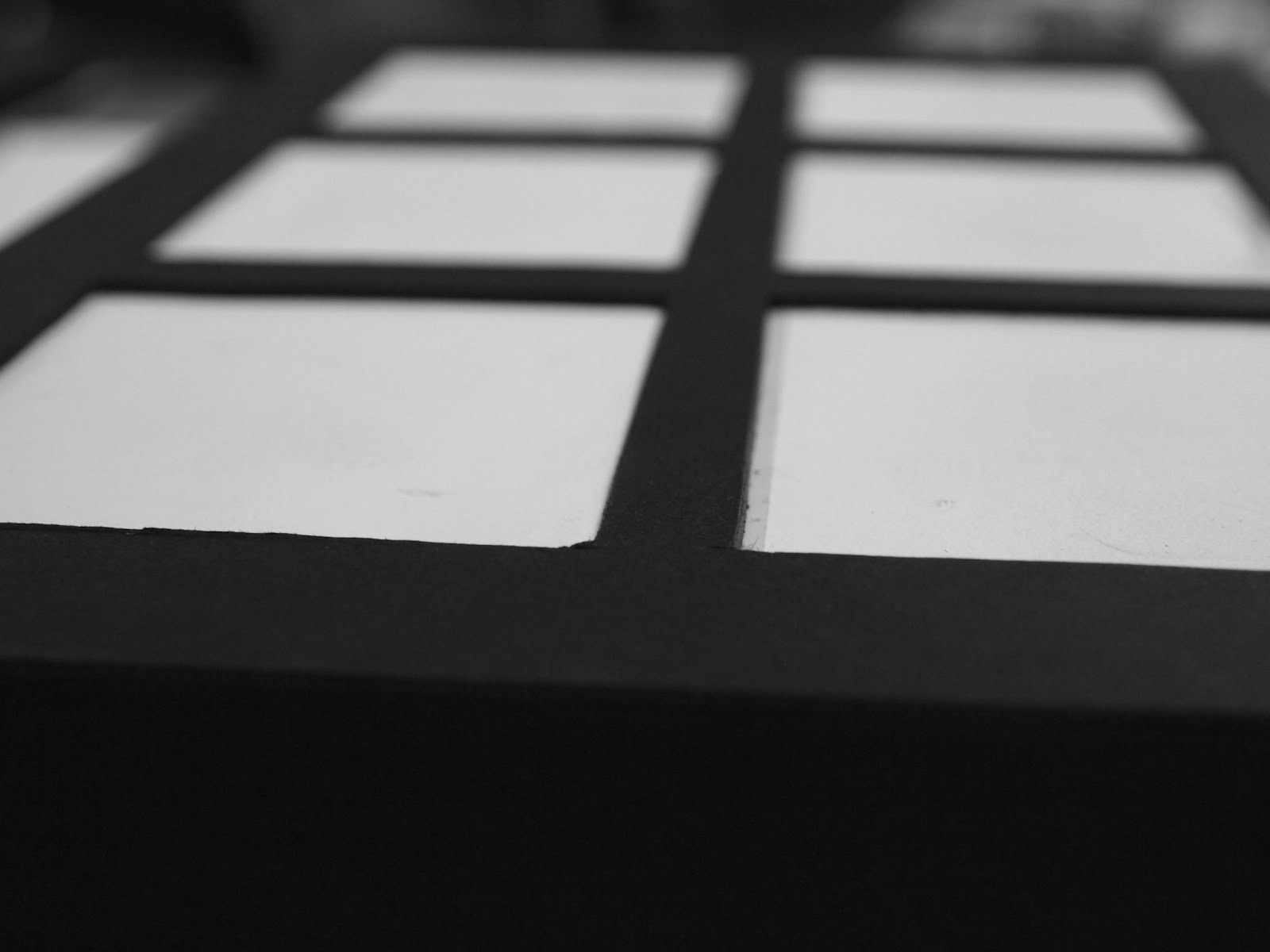
This model I wanted to focus on touch and the different textures that different objects give off. In showing this I wanted to put a wide range of substances into a malleable casings so they give off a wide variety of feelings without being able to recognise what the object is. I wanted to focus on the idea of touch rather than sight to identify a common household item so this sense of the user could be strengthen. The whole creation is a box to give off the sense of mystery and contrast. Mystery in the sense that you cannot tell what is enclosed, as every ‘window’ looks identical and contrast with the use of colour and malleability; as the rubber is white and the card is black showing that they are used for different purposes of the model, the card is used for support, while the rubber is used to be poked and prodded by the user to experience the different textures the objects give off.


Instruction
The main purpose of this model is to enhance the use of touch as inside this interactive object the windows hold different substances that gives of a different sensation, some may even trigger pervious memories. I want the user to feel comfortable to explore the different textures felt from the objects enclosed; they can push down with one finger on the white rubber or their whole hand.  The user should not be afraid to lift the box up and push the sections from both sides at the same time or turn it on its side or even feel different sections at the same time. The box is for the user to experience touch, as everyone experiences things differently this model has been created with no right or wrong way to use it, as long as the user feels a new sensation from it, then it will be used correctly.

Sunday, 5 August 2012

200 words


This model I want to focus on touch and the different textures that different object give off. In showing this I wanted to put a wide range of objects in to a malleable casing so they give of a vide variety of textures with out being able to recognise what the object is so all you have to work out what the object is inside the malleable casing is the texture. I felt that rubber balloons are the best objects to use for this model as is easy to full up with different substances and thin enough for the different textures to be felt.
In the rubber case I want to use objects such as; flour, corn flour, water, rice and salt as they all have different densities and textures. As the layout of the model I want it the textures to be felt as a whole and as individuals so I want all of the rubber cases to be lined up one by one in a square so the user can run their whole hand across all the balloons and feel the different densities of the balloons. Also the user can touch the balloons individually to feel the difference between the other textures of the surrounding balloons have.

Sunday, 17 June 2012

A New way of seeing FINAL VIDEO


This is my final stop motion for DSDN 101"A new way of seeing" looking at my interpretations of Industrial design with a new way of seeing the development of the constructions on objects stating with natural products such as; sticks and leaves and then finishing with man made products such as plastic lego and plastic bags. I also wanted to focus on the physics of industrial design in the way that an objects has to work with the laws, this was shown in in the way the Lego and polystyrene fall down and get reconstructed.
I want to give a huge thank to Alaska as they gave me permission to use there song "introduction" in my film.


storyboard

Page one.

Page two.
this is my story board wanted it to have a montage of different self generated imagery, form photos, to text and also cartoons I made on Photoshop, I felt that the different medias was a fun and effective way to get my point across and also related to my film as it also used different materials, I wanted it to have a hand crafted collage feel as i like the way it looks and as my film was going to be hand made it related.

I based some aspects of my storyboard off the work of jo cheung, in the way she uses mix media to crate her work, I also like the way she gives them a vintage and hand crafted feel to them


Tuesday, 5 June 2012

300 words. "A New Way of Seeing"


I wanted to show in my stop motion film the way that industrial design uses different materials in construction. Over time industrial design has developed in the materials it uses, form natural products such as dirt, clay and wood, through to man made materials like plastic, polystyrene and metal. In my film I wanted it to start from a pile of materials that then moved and formed the letters of “A New Way of Seeing” with each letter being a different material. I want it to go in a time line of the development of materials in industrial design, staring off with sticks and grass and moving up into when man gets tools then to man made products like plastic and polystyrene.
I think one of the main aspects of industrial design is construction and development, so with in my film I want to detail on the making of the letter, so have close up of the textures and joining of the materials rather then showing the whole letter being arranged.
When you making physical design you normally focus on the detailing of a part of the object and don’t look at the whole picture till the end; so in the film I don’t want the whole quote and the letters not to be reviled till the end.
Another attribute I want to show within my film is the way that in industrial design I believe that the laws of physics plays a huge roll in the construction of the model, such as balance, weight distribution and centre of mass. So I wanted to show the restrictions that industrial can have buy showing one of my materials failing and having to show redevelopment of it to fit the laws of physics.
As whole I wanted to show that Industrial design is the new way of seeing how the new development of materials and how even thought that the physics cant be changed to can still improve what it can be constructed with.

Thursday, 31 May 2012

blog 5


The former Bank of New Zealand on Lampton quay was the first Bank of New Zealand. Built between 1899 and 1901 by architect Thomas Turnbull, the Bank building is Barque revival. It had a use of strong geometric shapes with the flued columns, arched windows and triangle cupolas but also lavish ornaments such as the lions and human heads imbedded in the walls, and organic flowing curves within the structure. It was said that there was meant to be more ornaments but the Government wouldn’t allow it, saying it was to lavish for a bank.
Before the bank was built John Plimmer owned a warehouse “Plimmer’s Ark”m the timber from this was recontracted into the bank and can still be seen today in the BNZ basement. The bank was used as the National Head Office and Wellington branch from 1901 through to 1984. Following this it moved to a new location. People had plans to pull it down to make way for the building boom of the 1960’s - 80’s, but for the next 20 years people fought to keep the bank building. In 1999 the bank was opened as a retail complex that has access to an underground mall and The Grand Arcade on Willis street. The Bank is now protected by the Heritage Order, meaning that the building will not be destroyed in the near future.

Kelly, M. (1961). Heritage trail. Old shoreline, Wellington city. Wellington City Council, Wellington, New Zealand

Cattell, J. (1986). Historic buildings of Wellington: a register of classified buildings. Government Printing Office Publishing, Wellington, N.Z.

Griffin, RH. (2001). Old BNZ Wellington : an architectural survey of the buildings used by the Bank of New Zealand on the Lambton Quay - Customhouse Quay - Hunter Street site. O'Griffy. Auckland, N.Z.